Last week I was talking to a virtual-first care provider with over 250,000 monthly active patients about their PROMs practices. During the call, their CMO mentioned that they have a PROMs compliance rate of 46%. This makes no sense to me! As I mentioned in a previous article, PROMs bring several advantages to the clinical table.
What about the other 54%? Does this mean that the organization doesn't know how 54% of its patients are doing? It seems so to me.
It's challenging to achieve compliance rates above 80% or 90%, but it's achievable with the right tools and mindset, as I will explain below.
Why should you believe me in the first place? Good question! In the last 3 years, I have implemented +35 care pathways in +20 care organizations (ranging from large hospital groups to series A virtual-first care providers). PROMs played a critical role in every pathway. Last year, one of our customers published scientific research that showed a 92% PROM compliance rate (2835 out of 3091 questionnaires were completed).
So what steps can you take to ensure you’re achieving a high compliance rate? Below are 5 practical tips that will help you increase data collection from patients - and make life easier for your entire care team.
1. Feedback loops
Providing ongoing feedback loops are crucial if you decide to start collecting PROMs. If you ask your patients to fill out a weekly or monthly questionnaire and you don’t provide feedback, your patients will have the feeling that you’re not doing anything with their answers.
So, what are some examples of feedback loops?
So, imagine Tim (a 24 yo adult struggling with mental health) fills in a PHQ9 in May, June and July. Looking at both scores, Tim his PHQ9 score increased by 30%. It’s clear something is wrong; Jane (his psychologist) proactively reaches out to Tim asking if he wants to set up a consultation.
Other examples are:
Patient lost +5% weight in the past week —> reach out
Patient says he is nauseous after treatment —> automatically send tips to counteract nausea
Patient says he has abnormal pain after treatment —> reach out and discuss treatment adjustments
Here is an example of two of our customers, they both implemented the exact same hip replacement care pathway. But one hospital uses the PROMs data to actually personalize care (=feedback loops) and the other one doesn’t:
In other words, if you collect PROMs, you should be prepared to act upon them.
And if you currently not acting upon the outcomes you collect; you’re not alone. According to a recent study that surveyed 70 healthcare organizations in Latin America, although 41% collect PROMs, less than 10% act upon them. That sounds pretty messy, doesn't it?
2. Share results and implications with your patients
Think about the last time you went to see a doctor in-person, were you able to see what they were looking at on their computer screen? Probably not. This got me thinking: why are doctors not showing our computer screens to the patient? Is it because they think patients will not understand the results on the screen? Or worse; do they think patients don’t care?
I had hoped that this would be different for virtual-first care providers who have a team of software engineers, product managers and designers that are building a good-looking (web) app. But it turned out that this was not always the case…
Last week, I signed up for a virtual-first mental health provider. I filled out 3 PROM questionnaires (it took me +15 minutes) and when I was finally done, nothing happened. Really, nothing. I could not revisit my answers or see my results. What a frustrating experience.
When you collect data, you need to turn this data into visual charts, graphs and representations to uncover insights like trends and blockers. Don’t show those visualizations only to your clinical team. Also show it to your patients so they can see, and understand, everything as well.
Not only is this a necessary strategy for shared decision-making, but it’ll also make conversations data-driven and motivates your patients to continue contributing their data.
3. Don’t make them look like questionnaires or surveys
I still have yet to encounter a patient who wished they’d gotten to fill out more questionnaires during their care journey. Let’s face it: filling in questionnaires is something you, as a caregiver, want. Not patients. To increase response rates, you need to reframe the data collection method so it doesn’t deter patients from participating. The better the visual design of your survey, the more likely patients are to not only complete it but also take your next survey.
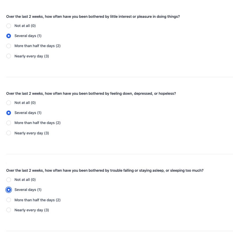
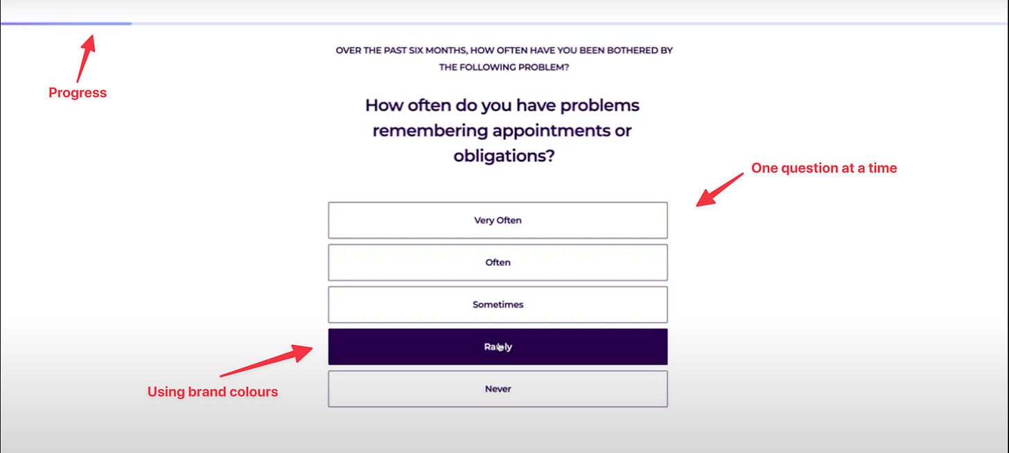
One way to do it is to design conversational-style flows that collect outcomes. Not showing the questions all at once is a simple but effective way to increase your compliance. So don’t do this:
But do this:
4. Give patients gentle nudges
Filling in a survey probably isn’t at the top of many patients ‘to-do’ list. That’s why you should give them a gentle reminder from time to time.
For instance, in the lung cancer pathway (where we achieved a 93% compliance rate) patients that don’t respond within 48 hours get an automated email reminder to fill in the questionnaire. If they don’t reply after the first reminder, they get a second one 3 days later. This increased our compliance rate significantly.
In the email reminders, you don’t ask to “fill in a questionnaire” (see point 3), but you need to:
Say you’re interested in knowing how they are doing
Explain the WHY (why is it important to fill in this questionnaire) and the HOW (how filling in this questionnaire will improve your life)
Have an appealing CTA (“Fill in this survey now” vs “Let us know how you’re doing”)
When designing anything, you always need to look at it from a jobs-to-be-done perspective. You need to think about how can you make the “What’s in it for me?” clear to your patient population. And what’s in it for them? Better care.
Oh and please (!!!) take the burden off of your care team and let technology do the boring, repetitive stuff. There are enough technologies (like Awell) out there that can fully automate the way you collect PROMs (yes, with automated reminders).
5. Don’t make it optional
In one of my projects, we had a below-average response rate from patients (54%). I wanted to know why, so I’ve followed up with one of the clinicians - and learned that he’d requested his patients’ participation in data collection as though it would be a favour.
“If you feel like it,” “When you have time,” and “Whether you might consider filling this in at home” — were the phrases the clinician had used when telling his patients about the questionnaires.
Today, there’s still a strong incentive for patients to do as the doctor says. So, if a clinician tells their patient to do something — like fill in a questionnaire, for instance — the odds are good that they’ll do it. But only if the phrasing is right.
When you’re including outcomes data collection in your care, have a proper (virtual) intake with your patient where you explain that questionnaire-driven data collection will help them get better overall clinical care. I assure you: when a patient doesn’t fill in their questionnaire and ends up in the consultation with a doctor who says, “If you’d have filled in your data, we’d be looking at your progress together right now,” they won’t make the same mistake again.
Besides, you should also be sure to mention that future cohorts of patients will experience more value if they comply with the data collection process now.
Conclusion
In this article, I proposed 5 things you can do to achieve +90% PROM compliance:
Act on the PROMs you collect
Elevate the patient to your level by looking at the data together, showing them how their responses can fuel the value of their care.
Think less in terms of “questionnaires,” and more in terms of a continuous flow of information between the care team and patient.
Remind patients to fill in the questionnaire
Highlight the importance of the patient’s compliance for themselves and future patients.
—
Rik Renard.
Feel free to connect with me on Twitter or LinkedIn. If you have a comment or feedback you can also send a note to rik@awellhealth.com


This article fits with many best practices that the UX community has found increase testing, surveys and forms. I am a long time UX professional that recently joined a healthcare industry startup. So I was excited to see some of the UX best practices in your article as well. I think we could both learn a lot from each other to make better patient experiences.
There is a lot in in the example the author shows besides just visual design that the author doesn't point out. And even more tips that can be reused. Conversational. YES!! But also the first example is repetitive. There is a very important precept in UX that if there is repeated data it's not useful data. As a UX designer the key question is "Is this experience important and meaningful". That goes for overall experience, but not for EVERY element. If everything is important nothing is important. Every one of the questions shown repeats the first part of the question, " Over the last 2 weeks , how often have you .....". The writer of the first example makes the most boring repetitive part the most important by putting it first and the same size as everything else. Highlight the differences and make them important. Deemphasize or hide, if possible, boring data. Using the rule of human conversation is a great. Summarize the framework for your audience. Imagine if you were talking to your parents. "Tell me how have been lately, say in the last couple of weeks...".
Nudges are great. (See the book Nudge). People skim their email. It's okay to remind them again.
What's in it for me. Make it worth their while and tell them why we are doing this and frame the task in terms of their goals. And then follow through. A marketing head once said, don't make them run the maze without giving them the cheese. What is their cheese? (Silly question but easy to remember ). Find out what your patients are trying to achieve. This ideally should be the first question. Don't assume you know the answer. Another opportunity to make their care, their own.
Jobs-to-done. YES! A great conceptual model and research methodology. The model is great for creating new solutions and products to users unknown problems. Ironically the endorsed research methodology suffers from the exact problem this article discusses. An exhausting survey that often ends in survey fatigue and drop off. But I encourage everyone to look into JTBD.
Great article. I hope readers take this to heart.
good chapter in the PROM playbook. would agree that "screen sharing" leads to higher health literacy and better shared decision making. my patients find it especially helpful when I review images with them or do bedside ultrasound and show what I am seeing. this is a luxury though, and stacked schedules and short visit times makes doing this for every patient prohibitive.